Pantone chose Mocha Mousse as the colour of 2025: warm but not aggressive, neutral but with personality. The moment I saw it, I wanted to explore what it actually means visually.
My process: I started gathering references on Pinterest, then organised them in PureRef to build a cohesive moodboard of colours, subjects, palette and architectural elements. I was after something almost photographic, something I could imagine in a design campaign.
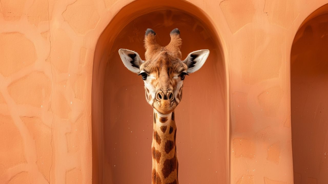
Then I used Midjourney to bring these concepts to life, iterating until the atmosphere felt right.
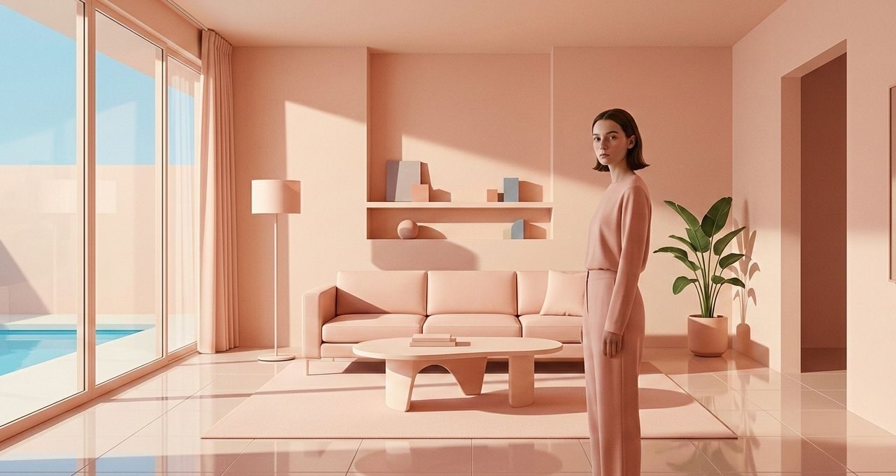
For those working in design or marketing: this combination of tools is especially useful in the exploratory phase. Quick concepts, testing directions, mockups for presentations. They do not replace real work, but they accelerate the phase where you are still figuring out where you want to go.
Each image must serve a purpose. I am learning to use AI generation not as a final output but as a thinking tool, a way to make the abstract concrete before committing to a direction.